Onsite popups are a powerful tool for online businesses, providing an effective and efficient way to communicate with visitors. The design of your onsite popup is crucial in determining its success and effectiveness.
A well-designed popup will catch the eye of visitors, communicate your message clearly and encourage them to take action. On the other hand, a poorly designed popup can be ignored or even cause visitors to leave your site.
Things to consider while designing onsite popups
There are many factors to consider when designing an onsite popup, including its size, color, layout, and content. You also need to think about the right moment to display the popup, the type of information you want to convey and the action you want visitors to take.
With so many options and variables, designing an onsite popup can seem overwhelming. However, by following a few key principles and best practices, you can create effective and visually appealing popups that help drive conversions and grow your business.
Creating an effective popup: tips and tricks
In this article, we will discuss the key elements of effective onsite popup design and provide tips and examples to help you create popups that engage and convert your visitors. Whether you’re just starting to add popups to your site or looking to improve the performance of existing ones, you’ll find valuable insights and advice on how to create popups that deliver results.
Navigation
To create a new onsite popup,
Step 1: Start by selecting "On Site" from the main menu. Once you've clicked on "Website Pop-up" in the left panel, navigate to the "Pop-ups" tab at the top of the page. Here, you'll be able to view all of the popups you've created and have the option to edit them or create a new one by clicking the "CREATE NEW POP-UP" button.

Step 2: After clicking the "CREATE NEW POPUP" button, you'll be presented with a list of popup categories to choose from, such as slider, sticky bar, floating buttons, or carousel. Select the type of popup you'd like to create. Then, proceed to the next step by clicking "continue". You'll be presented with a variety of pre-built templates, or you can choose to create a new popup from scratch by clicking "create new".

Step 3: Let's take the "Slider" category as an example and opt for the "Create New" option from the available templates.
Once you have selected the "Slider" category and chosen to create a new template, you will be presented with three tabs: Description, Setting, and Targeting Rules.
The Description tab includes all the necessary tools to design your popup, while the Setting tab offers options such as an auto-close timer, animation types, border colors, and more. The Targeting Rules tab displays various rules, such as session-based targeting, display triggers, URL-based triggers, and more, to help determine when and where your popup will appear.
Description Tab
The Description tab is comprised of three sub-tabs: Content, Rows, and Setting.
The Content tab offers various design elements, including titles, paragraphs, lists, images, buttons, and icons. The Rows tab allows you to arrange and combine different design blocks in various ways. Finally, the Setting tab provides default options, such as default text and link color, to help you further customize your popup design.
Let's explore the various features and tools available within these sub tabs, as we create a sample popup to showcase a 15% discount.
Title
First we are going to create a title for our popup. To do this follow the steps below.
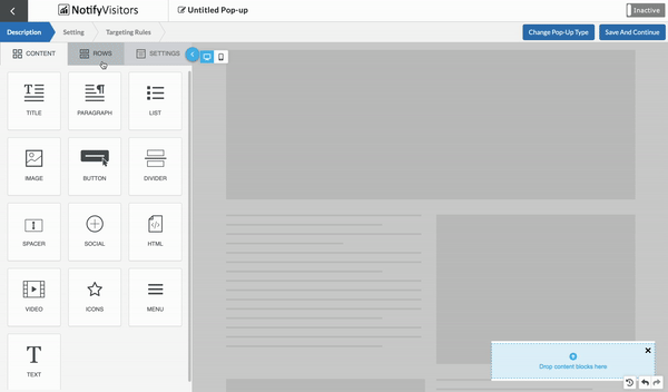
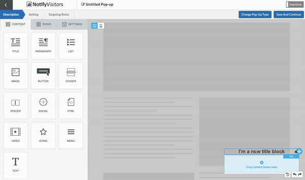
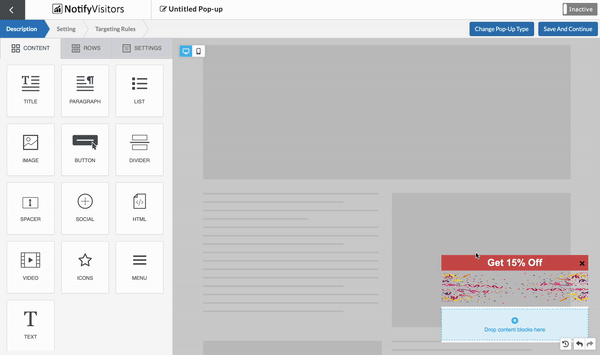
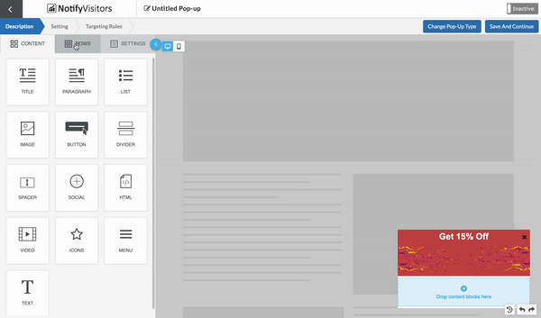
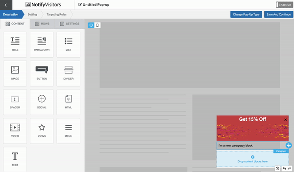
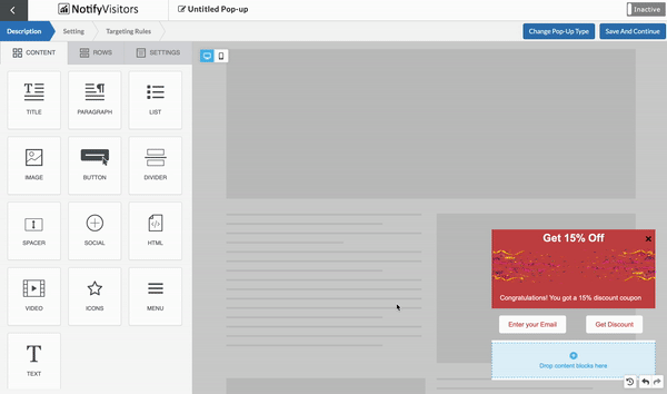
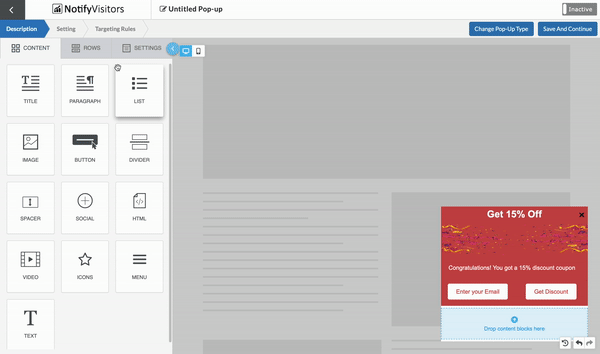
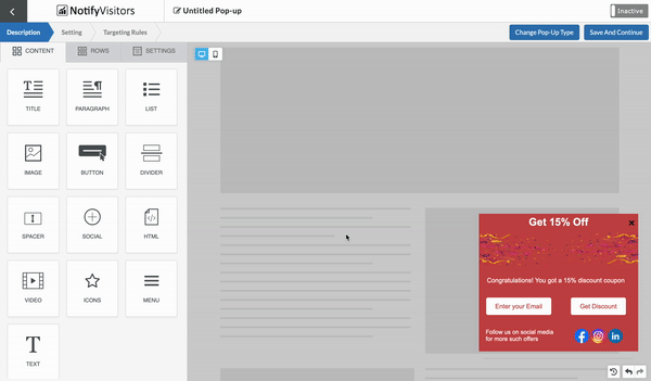
Step 1: To create our sample popup, let's start by going to the "Rows" tab. Here, you'll find a variety of row options to choose from. We will pick the first one with a single block. To do so, simply click on the row and drag and drop it into place. Next, navigate to the "Content" tab and drag and drop the title element.
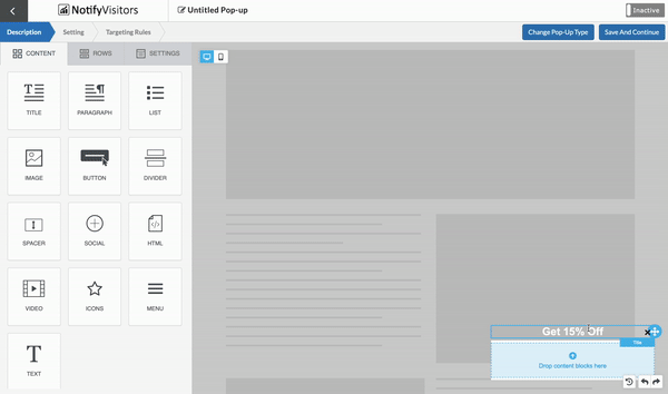
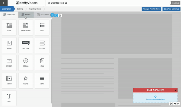
Step 2: Give it a name, such as "Get 15% Off". When you click on the text, a modifier box will appear, allowing you to choose options such as text type (bold, italic, underline, etc.). Additionally, the side menu will change to the "Content Properties" tab, offering options such as font type, size, and color. In this case, we will choose white color for our text.
Step 3: In this step, we will focus on the properties of the row by clicking on the blue line surrounding the block. This will reveal the row properties in the side menu. In this menu, you have the option to change the background color, alignments, and other options. For this sample popup, we will set the background color to red and keep the other settings unchanged.
Image
To enhance the visual appeal of the popup, let's add an image.
Step 1: To add an image to the popup, select a row with two block elements side by side from the rows tab, and drag and drop it under the title row. Then, go to the content tab, and drag and drop the image element into both blocks.
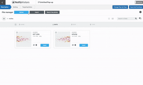
Step 2: To add an image to this block, click on the "browse" button and select one of the three available options: "Upload" to upload an image from your computer, "Import" to import an image from the internet, or "Search free image" to find a free image from the collection.
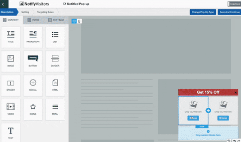
Here, we are going to upload an image to both blocks from our computer.
Step 3: Next, select the edge of the block and customize the background color in the same manner as we did with the title.
So far so good, Let's continue enhancing our popup by adding more content.
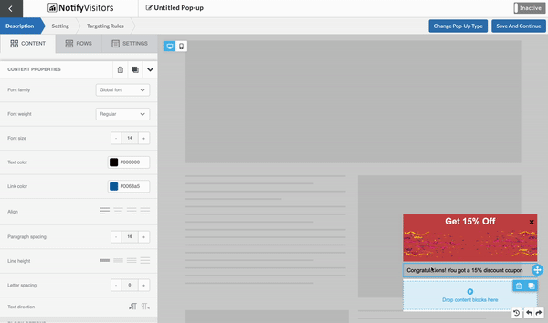
Paragraph
Next, we'll add descriptive text to our popup. For that
Step 1: We will add another row. Then, from the content tab, we will drag and drop a paragraph element onto this row.
Step 2: Write text and just like title text you can modify this text using the modifier box.
Step 3: Next, in the side menu, under content properties, select the font type, size, and color for the paragraph text. Then, select the edge of the block containing the paragraph text and assign a background color.
Button
To complete our popup, we will now add two buttons, one to enter email address and one to click and get the discount. To achieve this,
Step 1: We will add another row with two block elements side by side. Then, we will navigate to the Content tab and drag and drop the button element onto both blocks.

Step 2: Rename the text on the first button to "Enter your Email" and on the second button to "Get Discount".
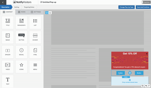
Step 3: Alter the font color and the button color to your desired choice from the available options in the content properties section.
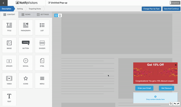
Step 4: Finally, customize the background color of the row by clicking on its edge and selecting the desired color from the available options.
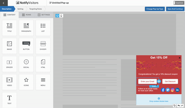
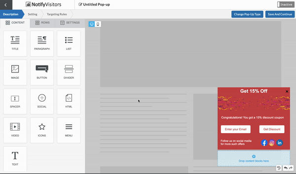
Social media icons and other icons
Icons play a significant role in making popups more appealing and interactive, and you can assign a direct link to these icons for increased engagement.
Step 1: To enhance our popup with the use of icons, we'll add a new row that contains two side-by-side blocks. Then, we'll drag and drop the Social element into this row. If you prefer custom icons, simply select the Icons element instead of Social, and you can add the desired icon. The remaining steps for custom icons are the same as for Social.
Step 2: Next, we will add a paragraph to provide a little bit information along with icons. Just like before add a paragraph to write text and apply a color to the row edge. A red background and white text color is used in this example.
Step 3: Next, it's time to add links to the icons. To do this, simply click on each icon and under the content properties section, add a link that corresponds to the selected icon. If you need to remove an icon, simply click the delete button and it will be removed from the popup.
Divider and Spacer
Next, we will be adding a divider and a spacer to our popup design. A divider helps to visually separate different sections of the popup, while the spacer creates space between two rows.
In this example we are going to use both
To include these elements in your design, you can drag and drop the divider and spacer elements from the content tab onto the desired row in your popup.
You can then adjust the size of the spacer using the content properties tab.
Menu
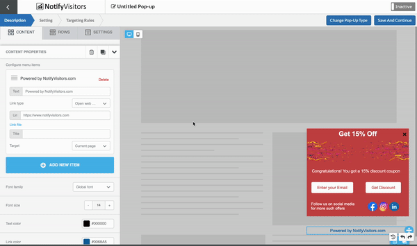
Next, we are going to add a menu button. This element allows us to add multiple items of text with attached links. To do so,
Step 1: Simply drag and drop the menu element from the content tab.
Step 2: Next click on the menu element that you have added and then click on the "Add new item" option in the content properties panel. Write the desired text and assign a link to it by filling the URL box. You can add multiple items by clicking "Add new item" again. In this example, we will only be using one item.
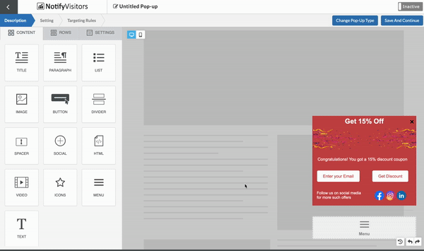
Step 3: Finally, modify the appearance of the text added through the menu element by adjusting its font size and color. Also, apply a color to the row as well
Now your Popup is almost ready, click save and continue.
Setting Tab
After clicking “save and continue” you will be redirected to the “Setting” tab.The setting tab for the popup offers a wide range of customization options, including a close button timer, auto close timer, animations, border and close icon color, and more. This Setting tab is distinct from the settings tab that we used earlier under description. The previous settings were used to establish default settings, while this setting tab allows for a deeper level of customization for the popup.
Experiment with the various options available in this tab to find the best configuration for your popup. In this example, we'll be using the "SLIDEINUP" animation and setting the border color to black, while leaving other options unchanged.

Click save and continue.
Congratulations! Your popup design is ready now. We have covered most of the features in this example.
Now, it's time for you to get creative and create your own using our drag-and-drop tool. To give you some inspiration, here are some examples of different types of popups we have created.

To know more in detail about various types of popups kindly check out our article “Exploring The Various Forms Of Onsite Pop-ups.”
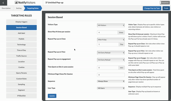
Targeting Rules
After creating a popup you will be navigated to “Targeting Rules” tab. Under this you can use various targeting rules as per your objectives.

With this feature, you can target specific segments of your audience based on a variety of criteria, such as their location, device, referral source, and more. This allows you to create highly targeted campaigns that are more likely to resonate with your audience and achieve your desired results.
To learn how to use targeting rules, kindly check out our article “How to Optimize Your Onsite Campaigns with Targeting Rules.”
Review Tab
In this tab, you'll discover all the settings and rules you've implemented for your onsite campaign.

First up is the “Original Pop-up” section, which includes the pop-up name, type, labels, and all the essential settings you've configured in the “setting” tab above, such as auto close, hide on scroll, animation, and more.
Following that, we have the targeting rules section. This area outlines fundamental targeting rules, including leave intent targeting, visitor types, time spent in a session, Page URLs, and additional criteria.
Next, we delve into the advanced targeting rules section. Here, you'll find details on runtime, source, device, browser, operating system, location rules, cookie rules, query rules, and any custom rules you've set up.
Note: Please consider that while we've listed all possible settings this section could include, any features or settings you haven't utilized will not be displayed, ensuring a more streamlined interface for you. This also simplifies troubleshooting any issues related to your onsite campaigns.
Preview your popup
Once everything is set up, you can also preview your popup and see how it will look on your website. This allows you to check out your designed popup on any site you prefer before making it live, giving you a clear idea of how it will function.
To preview, simply click the Preview button located at the top right.

A new window will open, giving you the opportunity to input the URL of the website or page where you want the preview popup to appear. You also have the option to decide if you want to preview the popup with or without targeting rules. Simply check or uncheck the targeting rules option according to your preferences.
After that, click “create preview link,” and a link will be generated for you.

You can either copy this link to share with others or select “open in new tab” to view it yourself.
Remember, the preview link will be valid upto 7 days. If you want to check the popup again after that period, you’ll need to create a new preview link.
Activating Popup
To make the popup live on the website, we need to activate it by clicking on the "Inactive" button located at the top right corner. Upon clicking, the button will turn green, displaying "Active" to indicate that the popup is now live.
Finally, click on the "Finish" button to complete the process and have the popup live on your website, ready to be viewed by your visitors.
Conclusion
Successful design of onsite popups depends on balancing marketing objectives with the user experience. It involves making informed choices about layout, placement, color, images, and typography. Keeping the focus on the user, testing and enhancing the design, and ensuring consistency with the website's overall appearance are crucial. Effective popup design results in conversions and engagement.
To achieve this, it is important to strike a balance between providing useful information and avoiding overwhelming the user with too much content or calls to action.
Was this article helpful?
That’s Great!
Thank you for your feedback
Sorry! We couldn't be helpful
Thank you for your feedback
Feedback sent
We appreciate your effort and will try to fix the article