Onsite sign-up forms constitute a vital part to any website. Signup forms are a tool to generate leads, collect emails for your newsletter, and to build new customers, depending on the nature of your business. Business organizations make use of sign-up forms to provide prospective or existing customers the opportunity to establish a lasting customer relationship.
It is quite important for businesses to optimize their sign-up forms for conversion. Sign-up form helps in building a list of engaged and permission-based subscribers. Also, it plays a significant role in your customer acquisition and retention strategy.
With NotifyVisitors sign up form campaigns, you can create your own sign-up form that is entirely customisable with widgets and themes to set your business apart from the competition. You can provide compelling CTAs to prompt people right away.
In this article you will learn various tools and methods to create effective signup forms that drive conversions.
Onsite Sign-Up Form: Methods & Approaches
NotifyVisitors facilitates its users to create signup forms with zero technical skills. With the help of simple designing tools, you can create signup forms as per your requirement and embed them anywhere in your website. There are few things which you need to define before actually creating signup for your website or brand.
1. Determine The Purpose of Your Sign-Up Form
Signup forms can have a variety of functions but typically share a common purpose: acquire personal information such as their name and email, in exchange for access to the latest information and services. Signup forms are generally utilized for lead generation, email collection for newsletters, event or webinar registration and many more. Once you define the purpose and goals with respect to the industry you are engaged into, designing a signup form will become an effortless task for you. An effective sign up form will have the following qualities-
Simplified subscription process - It should take users only a few seconds to sign up for your newsletter
A good first impression with your brand - the signup form must not be too burdensome, unattractive and complex that the users would hesitate to fill in subscription details
2. Select the Type of Form You Want For Your Website
A key component of creating an effective signup form is choosing the right signup tool. NotifyVisitors offers two types of Signup form namely - Slider, Sticky Bar. Select a type of form and design it according to your requirement. Our team of experts at NotifyVisitors created a user-friendly drag-and-drop tool to make the process easier.
With this tool's straightforward and user-friendly interface, anyone can easily design a signup form without any prior technological knowledge. It also provides a number of customization choices, including the capacity to alter fonts, layouts, and colors as well as to include material like photographs, videos, animation and other types of media. Thus, making it simple to develop a signup that matches the style and branding of your website, ensuring that it blends in with the rest of the website.
3. Design Your Sign-Up Form
Designing a signup form is quite a simple task. It is essential for you to maintain simplicity and readability while designing the signup form. Make sure that the form is simple to complete, and use clear, engaging headings. Moreover, make sure the signup form’s style matches with the website's basic design and that the language is crystal clear and easy to understand.
With the drag-and-drop tool of NotifyVisitors, creating an onsite signup form is a quick and easy process. The following are the step you need to follow-:
- Navigate to Onsite > Signup form over the NotifyVisitors Dashboard
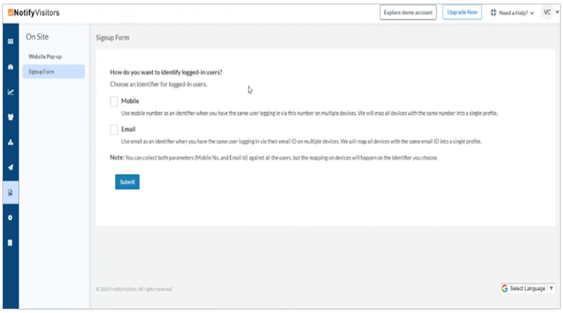
- If you are a first time user, a new modal shall appear asking you to choose an identifier for logged-in users i.e. mobile or email. Click on submit button
Note: You can collect both parameters (mobile number and email Id) against all the users, but the mapping on devices will happen on the identifier you choose. Also, once an identifier is chosen it cannot be changed later on.

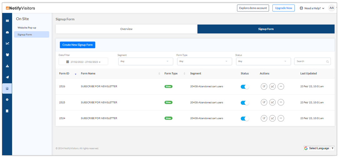
- Now, select Signup form and click on Create new Sign Up form

- Next, on this page you have to select the type of signup form (slider / sticky bar) you want for your website and then click on continue.
- Once you click continue, a variety of themes will be displayed; select the one you like or click "create Your Own."

- A new modal will appear where you will have to provide basic form details - the title and position of the form, the segment into which you would like to collect the leads. Also, you have an option to create a new segment (refer "How To Create a Segment” for more information). Now click on create

- With this, you must complete the four steps of creation process which involves-
› Designing a Sign-Up Form
› Designing a Thank-you Page
› Settings
› Targeting Rules
You can now start designing the signup form as per your specifications using our drag and drop editor. This entails selecting a layout for the text, images, videos, and other media in addition to changing the colors, fonts, and other design elements.

4. Enter The Right Targeting Rules
In order to increase the chances of conversions, it is very important to set the right triggers which will ensure that your signup form appears at the right time. Signup form may get triggered at a number of events, including page scrolling, button clicks, and website exits.
Thus, the advanced targeting rules feature of NotifyVisitors is a potent trigger tool that enables you to present the suitable signup form to the right user at the right time, improving the likelihood of conversion.
 Through this feature you may target a particular segment of your audience depending on a range of factors, like their location, device, source of referrals, and more. This enables you to set advanced rules and develop a fully customized onsite campaign that connects well with your audience to yield the intended outcomes.
For a thorough understanding of Targeting Rules, please refer to our comprehensive article, How To Optimize Your Onsite Campaigns With Targeting Rules."
5. Conduct Test For Better Optimisation
Once your signup form campaign is active, it’s time to assess it and make improvements to find the best course of action. Testing your campaign can aid in effective decision-making and performance optimization. But it is an optional step. You may choose to skip this step and go straight to step 6.
You can use A/B testing to evaluate your signup form campaign, and determine which variation performs better in order to make necessary modifications.
A/B testing allows you to compare the efficacy of various signup form variations by displaying one variation to a section of your visitors and a different variation to a different section of your visitors. This strategy aims to identify the more suitable signup version that generates better leads effectively.
The procedure is quite simple to follow. Use our drag and drop editor to create variations of your signup campaign. Also, in order to save some time, just duplicate an existing signup form and make the necessary changes.
After that, turn on one signup variant for a period of time, then turn it off. Repeat with the remaining variants. The goal is to evaluate each variation's performance and determine which one yields the greatest outcomes.
Our analytics tool allows you to monitor the effectiveness of each version, including the quantity of views, clicks, and conversions. You can compare these numbers to see which signup campaign variant performs the best. When you get the results, you can put the most successful signup form to your website.
6. Mobile Friendly Sign-Up Form
The experience of interacting with a signup form is very different between desktop and mobile device users. A signup form which is totally appropriate for desktop users can pose a problem to mobile visitors as it won’t appear the way it appears to desktop visitors. Therefore, to give your mobile users a positive user experience, you must make sure that your signup form is mobile-friendly. This means that it should be made with suitable font sizes and button sizes that are simple to tap on, as well as be easy to read and navigate on smaller devices. The signup form should also be adjusted to appear excellent in both portrait and landscape views across a range of screen resolutions and orientations. To ensure that it occupies the proper amount of space and doesn't obscure crucial material, the signup must be responsive and adapt to the size of the screen.
By defining the technology settings, your signup form can be made available to all users, irrespective of their device or screen size. Thus, a mobile-friendly signup form would increase the overall conversion rates.
Conclusion
To sum up, developing a successful onsite signup form can be a quick and easy approach to boost the functionality of your website and generate more leads. You can customize it to your unique requirements and objectives by taking the time to identify its purpose, select the appropriate tool, design, and test it.
Was this article helpful?
That’s Great!
Thank you for your feedback
Sorry! We couldn't be helpful
Thank you for your feedback
Feedback sent
We appreciate your effort and will try to fix the article